
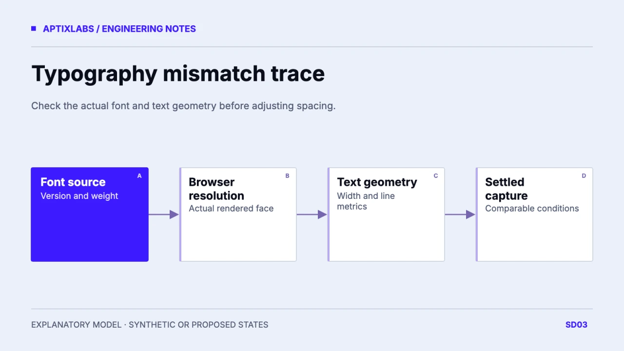
Trace a Figma-to-browser typography mismatch through the actual font file, resolved family, available weight and layout geometry. Compare settled captures before deciding that spacing or the design itself is wrong.
Separate missing fonts from different rendering
Begin with one synthetic heading and the exact text used in the design. Record the intended family, style, weight and font source. Figma’s conflicting-font guidance matters because matching family names can conceal different installed font versions. Browser font loading has its own network and CSS path. A family declaration does not prove the browser used that face for every glyph. Check missing glyph fallback as well as a completely missing font. Keep the operating system and browser version in the comparison record, since rasterization can differ even when layout metrics agree.
Inspect the font that the browser can actually use
Review the @font-face declarations, file responses, weight ranges and computed styles. A declared weight of 600 can still render using a substituted or synthesized face if that weight is absent. Compare the file version and license with the design team’s approved source. Use the browser’s rendered-font inspection for the selected element rather than relying only on the CSS family string. Do not redistribute a locally installed commercial font merely to make a screenshot match; resolve the web license and delivery method with the responsible owner first.
| Observation | Inspect next |
|---|---|
| All glyphs look different | Font response and rendered face |
| Only bold text differs | Available weight and synthesis |
| Extra wrapped line | Width, padding and metrics |
| Early capture differs | Font and content readiness |
Hold width, content and text settings constant
Line wrapping depends on content width, padding and font metrics together. Check line-height, letter-spacing, font-size and whether the design uses a fixed text box. A narrow card can create an extra line even with the correct font. Compare the same viewport, browser zoom and application scale. Measure the heading box and line count before changing a global token. A local correction that compensates for one wrong width can create drift across every other card. Record the first differing metric so a reviewer can distinguish geometry from letter-shape differences.
await page.evaluate(async () => {
  await document.fonts.ready;
  return { ready: document.fonts.check('600 32px Inter') };
});
Capture only after fonts and required content settle
The repository’s export script explicitly waits for document.fonts.ready before producing its HTML snapshot. That is useful source evidence for readiness handling, not a measured result for every route. A reproducible browser check can await the font promise, inspect whether matching faces still require loading with document.fonts.check and then capture the element’s bounding rectangle. check() can return true for a nonexistent face; it does not confirm font availability. These APIs do not prove visual equivalence or guarantee the intended glyph source. A before-and-after experiment should deliberately control font delivery; two captures from a warm cache may never exercise the missing-font state at all.
MDN: FontFaceSet.check limitations
Keep the finding small enough to reproduce
A good typography finding includes the heading text, Figma node, font-file identifier, CSS declaration, viewport and settled capture. State whether the mismatch is a failed request, absent weight, different line wrap or residual rendering difference. Correct one layer and repeat the comparison under the same conditions. If metrics match and only antialiasing differs, do not repeatedly adjust spacing to chase a pixel-perfect score. The deliverable is an explained discrepancy and an accepted rendering range, with unresolved platform differences visible to both design and engineering.
Figma MCP acceptance tests: check the UI beyond the matching screenshot
Product design handoff specification
Bring a representative heading, its approved font source and a settled capture to review the mismatch.
B2B SaaS development: scope and acceptance
Does document.fonts.ready prove a Figma match?
No. It establishes font-loading readiness for the document; inspect the actual face, geometry and capture conditions separately.
Should every antialiasing difference be fixed with CSS?
No. First verify font source and layout metrics. Platform rendering differences may remain after those agree.