
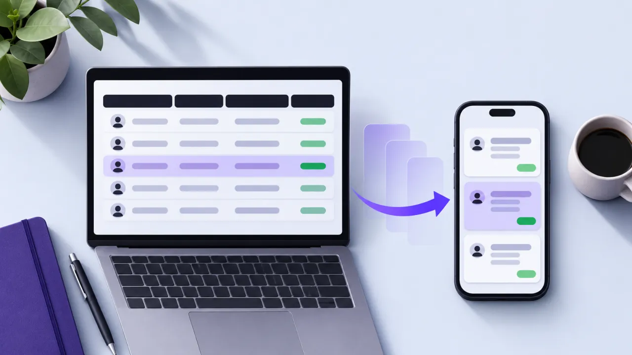
A desktop client table often encodes several tasks at once: identifying a person, comparing progress, finding an exception and taking action. Shrinking every column onto a phone does not preserve those tasks. Redesign the mobile view around the information needed for the next decision.
The contract to define first
Prioritize identity, review reason and the main action. Move secondary values into an accessible detail view and retain sorting or filtering that supports the coach’s work. Avoid horizontal scrolling as the only way to discover critical actions. The mobile representation should respect the same permissions and state meanings as the desktop table.
A worked scenario
A synthetic coach reviewing missed check-ins on a phone needs the client name, relevant date and follow-up status before a detailed metric grid. A focused card can expose those items while keeping the underlying record one deliberate action away.
An implementation and review sequence
- Identify the task behind each desktop column
- Choose a clear mobile information hierarchy
- Verify filters actions and return navigation on small screens
Failure cases worth testing
| Condition or input | Expected behavior |
|---|---|
| A secondary column is hidden | Its essential action remains discoverable |
| Text size increases | Identity and primary action remain readable |
| Coach returns from detail | Their filter and review position are preserved |
Download the illustrative acceptance checklist (JSON)
Tradeoffs and limits
Cards can make cross-client comparison harder. Keep an alternative compact comparison view when that task matters, rather than assuming one responsive layout serves every workflow equally well.
Use the result to make a decision
The practical output is straightforward: redesign client review tasks for small screens with readable hierarchy. Keep the assumptions with the artifact so a product owner, implementer or prospective partner can review the same decision. A useful handoff states the supported scope, the evidence collected and the remaining dependency instead of treating a successful demonstration as proof of every operating condition.
Continue with related implementation detail
Related guide: Design a coach portal as an account-scoped product workspace.
AI-generated UI quality checklist
Designing SaaS permission interfaces
References and current platform requirements
Figma: MCP server documentation
Figma: connecting React components
The linked references provide platform or process context. The worked scenario and acceptance matrix are original examples; adapt them to the actual product, supported environment and documented responsibilities.
Discuss the workflow
Bring a representative Figma flow and its component states to scope a design-to-code engagement.
Explore the relevant AptixLabs service
Should a mobile coach portal preserve every desktop column?
A desktop client table often encodes several tasks at once: identifying a person, comparing progress, finding an exception and taking action. Cards can make cross-client comparison harder.
Which failure cases should be included in the review?
Include these explicit cases: A secondary column is hidden: its essential action remains discoverable; Text size increases: identity and primary action remain readable; Coach returns from detail: their filter and review position are preserved.